CSS 让一个元素在另一个元素底层

在网页开发中,有时候我们需要控制元素的层级关系,让一个元素在另一个元素的底层显示。这在设计页面布局、创建特效等方面都非常有用。本文将介绍如何使用CSS来实现这一效果。
1. 使用z-index属性
在CSS中,可以使用z-index属性来控制元素的层级关系。z-index的值越大,元素就越靠近顶层。如果两个元素的z-index相同,后面的元素会覆盖前面的元素。
示例代码如下:
<!DOCTYPE html>
<html lang="en">
<head>
<meta charset="UTF-8">
<meta name="viewport" content="width=device-width, initial-scale=1.0">
<title>Z-index示例</title>
<style>
    .box1 {
        width: 200px;
        height: 200px;
        background-color: red;
        position: absolute;
        top: 50px;
        left: 50px;
        z-index: 1;
    }
    .box2 {
        width: 150px;
        height: 150px;
        background-color: blue;
        position: absolute;
        top: 100px;
        left: 100px;
        z-index: 2;
    }
</style>
</head>
<body>
<div class="box1"></div>
<div class="box2"></div>
</body>
</html>
在上面的示例中,box2元素的z-index值比box1元素大,所以box2元素会在box1元素的底层显示。
2. 使用position属性
除了z-index属性,position属性也可以影响元素的层级关系。当元素的position属性值为static时,z-index属性不会生效;当position属性值为relative、absolute或fixed时,z-index属性才会生效。
示例代码如下:
<!DOCTYPE html>
<html lang="en">
<head>
<meta charset="UTF-8">
<meta name="viewport" content="width=device-width, initial-scale=1.0">
<title>Position示例</title>
<style>
    .box1 {
        width: 200px;
        height: 200px;
        background-color: red;
        position: relative;
        top: 50px;
        left: 50px;
        z-index: 1;
    }
    .box2 {
        width: 150px;
        height: 150px;
        background-color: blue;
        position: absolute;
        top: 100px;
        left: 100px;
        z-index: 2;
    }
</style>
</head>
<body>
<div class="box1"></div>
<div class="box2"></div>
</body>
</html>
代码运行结果:
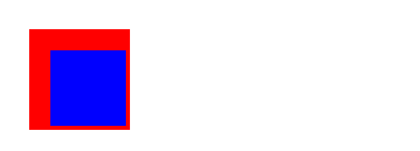
在上面的示例中,box1元素的position属性值为relative,box2元素的position属性值为absolute,所以box2元素会在box1元素的底层显示。
3. 使用负值z-index
有时候,我们还可以使用负值的z-index来控制元素的层级关系。负值的z-index会让元素在普通元素的底层显示。
示例代码如下:
<!DOCTYPE html>
<html lang="en">
<head>
<meta charset="UTF-8">
<meta name="viewport" content="width=device-width, initial-scale=1.0">
<title>负值z-index示例</title>
<style>
    .box1 {
        width: 200px;
        height: 200px;
        background-color: red;
        position: absolute;
        top: 50px;
        left: 50px;
        z-index: -1;
    }
    .box2 {
        width: 150px;
        height: 150px;
        background-color: blue;
        position: absolute;
        top: 100px;
        left: 100px;
        z-index: 1;
    }
</style>
</head>
<body>
<div class="box1"></div>
<div class="box2"></div>
</body>
</html>
在上面的示例中,box1元素的z-index值为-1,所以box1元素会在box2元素的底层显示。
4. 使用opacity属性
除了z-index属性,opacity属性也可以影响元素的层级关系。当元素的opacity值小于1时,元素会变得半透明,从而让底层元素显示出来。
示例代码如下:
<!DOCTYPE html>
<html lang="en">
<head>
<meta charset="UTF-8">
<meta name="viewport" content="width=device-width, initial-scale=1.0">
<title>Opacity示例</title>
<style>
    .box1 {
        width: 200px;
        height: 200px;
        background-color: red;
        position: absolute;
        top: 50px;
        left: 50px;
        opacity: 0.5;
    }
    .box2 {
        width: 150px;
        height: 150px;
        background-color: blue;
        position: absolute;
        top: 100px;
        left: 100px;
    }
</style>
</head>
<body>
<div class="box1"></div>
<div class="box2"></div>
</body>
</html>
在上面的示例中,box1元素的opacity值为0.5,所以box1元素会变得半透明,从而让box2元素在底层显示。
5. 使用clip-path属性
clip-path属性可以裁剪元素的显示区域,从而让底层元素显示出来。可以通过定义不同形状的clip-path来实现不同的效果。
示例代码如下:
<!DOCTYPE html>
<html lang="en">
<head>
<meta charset="UTF-8">
<meta name="viewport" content="width=device-width, initial-scale=1.0">
<title>Clip-path示例</title>
<style>
    .box1 {
        width: 200px;
        height: 200px;
        background-color: red;
        position: absolute;
        top: 50px;
        left: 50px;
        clip-path: circle(50%);
    }
    .box2 {
        width: 150px;
        height: 150px;
        background-color: blue;
        position: absolute;
        top: 100px;
        left: 100px;
    }
</style>
</head>
<body>
<div class="box1"></div>
<div class="box2"></div>
</body>
</html>
在上面的示例中,box1元素的clip-path为圆形,所以box1元素会被裁剪成圆形,从而让box2元素在底层显示。
6. 使用mix-blend-mode属性
mix-blend-mode属性可以控制元素的混合模式,从而让底层元素显示出来。可以通过定义不同的混合模式来实现不同的效果。
示例代码如下:
<!DOCTYPE html>
<html lang="en">
<head>
<meta charset="UTF-8">
<meta name="viewport" content="width=device-width, initial-scale=1.0">
<title>Mix-blend-mode示例</title>
<style>
    .box1 {
        width: 200px;
        height: 200px;
        background-color: red;
        position: absolute;
        top: 50px;
        left: 50px;
        mix-blend-mode: multiply;
    }
    .box2 {
        width: 150px;
        height: 150px;
        background-color: blue;
        position: absolute;
        top: 100px;
        left: 100px;
    }
</style>
</head>
<body>
<div class="box1"></div>
<div class="box2"></div>
</body>
</html>
在上面的示例中,box1元素的mix-blend-mode为multiply,所以box1元素会与box2元素混合显示,从而让box2元素在底层显示。
7. 使用backface-visibility属性
backface-visibility属性可以控制元素的背面是否可见,从而让底层元素显示出来。可以通过设置backface-visibility为hidden来实现这一效果。
示例代码如下:
<!DOCTYPE html>
<html lang="en">
<head>
<meta charset="UTF-8">
<meta name="viewport" content="width=device-width, initial-scale=1.0">
<title>Backface-visibility示例</title>
<style>
    .box1 {
        width: 200px;
        height: 200px;
        background-color: red;
        position: absolute;
        top: 50px;
        left: 50px;
        backface-visibility: hidden;
    }
    .box2 {
        width: 150px;
        height: 150px;
        background-color: blue;
        position: absolute;
        top: 100px;
        left: 100px;
    }
</style>
</head>
<body>
<div class="box1"></div>
<div class="box2"></div>
</body>
</html>
在上面的示例中,box1元素的backface-visibility为hidden,所以box1元素的背面不可见,从而让box2元素在底层显示。
8. 使用transform属性
transform属性可以对元素进行变换,包括平移、旋转、缩放等。通过设置不同的transform值,可以让元素在另一个元素的底层显示。
示例代码如下:
<!DOCTYPE html>
<html lang="en">
<head>
<meta charset="UTF-8">
<meta name="viewport" content="width=device-width, initial-scale=1.0">
<title>Transform示例</title>
<style>
    .box1 {
        width: 200px;
        height: 200px;
        background-color: red;
        position: absolute;
        top: 50px;
        left: 50px;
        transform: rotate(45deg);
    }
    .box2 {
        width: 150px;
        height: 150px;
        background-color: blue;
        position: absolute;
        top: 100px;
        left: 100px;
    }
</style>
</head>
<body>
<div class="box1"></div>
<div class="box2"></div>
</body>
</html>
在上面的示例中,box1元素的transform为rotate(45deg),所以box1元素会被旋转,从而让box2元素在底层显示。
9. 使用filter属性
filter属性可以对元素进行滤镜效果,包括模糊、对比度、亮度等。通过设置不同的filter值,可以让元素在另一个元素的底层显示。
示例代码如下:
<!DOCTYPE html>
<html lang="en">
<head>
<meta charset="UTF-8">
<meta name="viewport" content="width=device-width, initial-scale=1.0">
<title>Filter示例</title>
<style>
    .box1 {
        width: 200px;
        height: 200px;
        background-color: red;
        position: absolute;
        top: 50px;
        left: 50px;
        filter: blur(5px);
    }
    .box2 {
        width: 150px;
        height: 150px;
        background-color: blue;
        position: absolute;
        top: 100px;
        left: 100px;
    }
</style>
</head>
<body>
<div class="box1"></div>
<div class="box2"></div>
</body>
</html>
在上面的示例中,box1元素的filter为blur(5px),所以box1元素会被模糊处理,从而让box2元素在底层显示。
10. 使用pointer-events属性
pointer-events属性可以控制元素是否响应鼠标事件。通过设置pointer-events为none,可以让元素在另一个元素的底层显示,并且不响应鼠标事件。
示例代码如下:
<!DOCTYPE html>
<html lang="en">
<head>
<meta charset="UTF-8">
<meta name="viewport" content="width=device-width, initial-scale=1.0">
<title>Pointer-events示例</title>
<style>
    .box1 {
        width: 200px;
        height: 200px;
        background-color: red;
        position: absolute;
        top: 50px;
        left: 50px;
        pointer-events: none;
    }
    .box2 {
        width: 150px;
        height: 150px;
        background-color: blue;
        position: absolute;
        top: 100px;
        left: 100px;
    }
</style>
</head>
<body>
<div class="box1"></div>
<div class="box2"></div>
</body>
</html>
在上面的示例中,box1元素的pointer-events为none,所以box1元素不响应鼠标事件,从而让box2元素在底层显示。
通过以上示例代码,我们可以看到不同的CSS属性和技巧如何帮助我们控制元素的层级关系,让一个元素在另一个元素的底层显示。在实际开发中,可以根据具体需求选择合适的方法来实现所需效果。
此处评论已关闭