CSS 超过宽度自动换行

在网页开发中,经常会遇到文本内容超过容器宽度的情况,这时就需要使用CSS来控制文本的换行。本文将详细介绍如何使用CSS来实现文本超过宽度自动换行的效果。
1. 使用word-wrap属性
word-wrap属性用于指定是否允许单词内换行。当设置为break-word时,如果一个单词太长无法完全显示在一行上,会自动换行。
示例代码如下:
<!DOCTYPE html>
<html lang="en">
<head>
<meta charset="UTF-8">
<title>Word Wrap Example</title>
<style>
.container {
width: 200px;
border: 1px solid #ccc;
word-wrap: break-word;
}
</style>
</head>
<body>
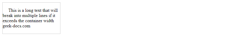
<div class="container">
This is a long text that will break into multiple lines if it exceeds the container width sotoolbox.com
</div>
</body>
</html>
Output:

运行结果:文本超过容器宽度时会自动换行。
2. 使用white-space属性
white-space属性用于控制元素内空白的处理方式,其中pre-wrap值会保留空白符并允许换行。
示例代码如下:
<!DOCTYPE html>
<html lang="en">
<head>
<meta charset="UTF-8">
<title>White Space Example</title>
<style>
.container {
width: 200px;
border: 1px solid #ccc;
white-space: pre-wrap;
}
</style>
</head>
<body>
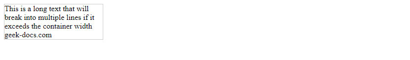
<div class="container">
This is a long text that will break into multiple lines if it exceeds the container width sotoolbox.com
</div>
</body>
</html>
Output:
运行结果:文本超过容器宽度时会自动换行。
3. 使用overflow-wrap属性
overflow-wrap属性用于指定是否允许单词内换行,与word-wrap属性类似。当设置为break-word时,会在单词内换行。
示例代码如下:
<!DOCTYPE html>
<html lang="en">
<head>
<meta charset="UTF-8">
<title>Overflow Wrap Example</title>
<style>
    .container {
        width: 200px;
        border: 1px solid #ccc;
        overflow-wrap: break-word;
    }
</style>
</head>
<body>
<div class="container">
    This is a long text that will break into multiple lines if it exceeds the container width sotoolbox.com
</div>
</body>
</html>
Output:
运行结果:文本超过容器宽度时会自动换行。
4. 使用text-overflow属性
text-overflow属性用于指定当文本溢出容器时如何显示。当设置为ellipsis时,会在文本溢出时显示省略号。
示例代码如下:
<!DOCTYPE html>
<html lang="en">
<head>
<meta charset="UTF-8">
<title>Text Overflow Example</title>
<style>
    .container {
        width: 200px;
        border: 1px solid #ccc;
        white-space: nowrap;
        overflow: hidden;
        text-overflow: ellipsis;
    }
</style>
</head>
<body>
<div class="container">
    This is a long text that will be truncated with an ellipsis if it exceeds the container width sotoolbox.com
</div>
</body>
</html>
Output:

运行结果:文本超过容器宽度时会显示省略号。
5. 使用max-width属性
max-width属性用于指定元素的最大宽度,当内容超过最大宽度时会自动换行。
示例代码如下:
<!DOCTYPE html>
<html lang="en">
<head>
<meta charset="UTF-8">
<title>Max Width Example</title>
<style>
    .container {
        max-width: 200px;
        border: 1px solid #ccc;
    }
</style>
</head>
<body>
<div class="container">
    This is a long text that will break into multiple lines if it exceeds the maximum width sotoolbox.com
</div>
</body>
</html>
Output:

运行结果:文本超过最大宽度时会自动换行。
6. 使用flex-wrap属性
flex-wrap属性用于指定flex容器内的项目是否允许换行。当设置为wrap时,项目会自动换行。
示例代码如下:
<!DOCTYPE html>
<html lang="en">
<head>
<meta charset="UTF-8">
<title>Flex Wrap Example</title>
<style>
    .container {
        display: flex;
        flex-wrap: wrap;
        width: 200px;
        border: 1px solid #ccc;
    }
    .item {
        flex: 1 0 50%;
    }
</style>
</head>
<body>
<div class="container">
    <div class="item">This is a long text that will break into multiple lines if it exceeds the container width sotoolbox.com</div>
    <div class="item">This is another long text that will break into multiple lines if it exceeds the container width sotoolbox.com</div>
</div>
</body>
</html>
Output:
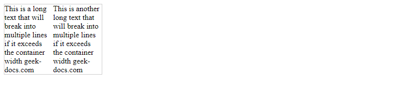
运行结果:项目超过容器宽度时会自动换行。
7. 使用grid-template-columns属性
grid-template-columns属性用于指定网格容器的列宽。当设置为repeat(auto-fill, minmax(200px, 1fr))时,会自动填充列并在超出容器宽度时换行。
示例代码如下:
<!DOCTYPE html>
<html lang="en">
<head>
<meta charset="UTF-8">
<title>Grid Template Columns Example</title>
<style>
    .container {
        display: grid;
        grid-template-columns: repeat(auto-fill, minmax(200px, 1fr));
        gap: 10px;
    }
    .item {
        border: 1px solid #ccc;
    }
</style>
</head>
<body>
<div class="container">
    <div class="item">This is a long text that will break into multiple lines if it exceeds the container width sotoolbox.com</div>
    <div class="item">This is another long text that will break into multiple lines if it exceeds the container width sotoolbox.com</div>
</div>
</body>
</html>
Output:
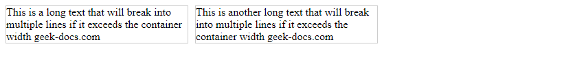
运行结果:项目超过容器宽度时会自动换行。
8. 使用column-count属性
column-count属性用于指定元素的列数,当内容超过列数时会自动换行。
示例代码如下:
<!DOCTYPE html>
<html lang="en">
<head>
<meta charset="UTF-8">
<title>Column Count Example</title>
<style>
    .container {
        column-count: 2;
        column-gap: 20px;
    }
</style>
</head>
<body>
<div class="container">
    This is a long text that will break into multiple columns if it exceeds the container width sotoolbox.com
</div>
</body>
</html>
Output:
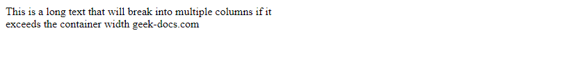
运行结果:文本超过容器宽度时会自动换行并分成两列。
9. 使用break-inside属性
break-inside属性用于指定元素内部如何分页。当设置为avoid时,会尽量避免在元素内部分页。
示例代码如下:
<!DOCTYPE html>
<html lang="en">
<head>
<meta charset="UTF-8">
<title>Break Inside Example</title>
<style>
    .container {
        width: 200px;
        border: 1px solid #ccc;
    }
    .item {
        break-inside: avoid;
    }
</style>
</head>
<body>
<div class="container">
    <div class="item">This is a long text that will try to avoid breaking inside if it exceeds the container width sotoolbox.com</div>
</div>
</body>
</html>
Output:
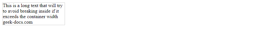
运行结果:文本超过容器宽度时会尽量避免在元素内部分页。
10. 使用hyphens属性
hyphens属性用于指定是否允许单词内断字。当设置为auto时,会在需要时自动断字。
示例代码如下:
<!DOCTYPE html>
<html lang="en">
<head>
<meta charset="UTF-8">
<title>Hyphens Example</title>
<style>
    .container {
        width: 200px;
        border: 1px solid #ccc;
        hyphens: auto;
    }
</style>
</head>
<body>
<div class="container">
    This is a long text that will break into multiple lines and hyphenate if it exceeds the container width sotoolbox.com
</div>
</body>
</html>
Output:
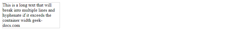
运行结果:文本超过容器宽度时会自动换行并在需要时断字。
通过以上示例代码,我们可以看到不同的CSS属性如何实现文本超过宽度自动换行的效果。在网页开发中,根据实际需求选择合适的属性来控制文本的换行方式,以确保内容能够清晰展示并提升用户体验。
此处评论已关闭