CSS文字超出自动换行
在网页设计中,经常会遇到文字内容过长而导致超出容器边界的情况。为了让文字内容在超出容器边界时自动换行,我们可以使用CSS来实现。本文将详细介绍如何使用CSS来实现文字超出自动换行的效果,并提供多个示例代码供参考。
1. 使用word-wrap属性
word-wrap属性用于指定当一个单词太长而无法适应容器时是否允许换行。可以设置为normal或break-word。
示例代码如下:
<!DOCTYPE html>
<html lang="en">
<head>
<meta charset="UTF-8">
<title>Word Wrap Example</title>
<style>
.container {
width: 200px;
border: 1px solid #ccc;
padding: 10px;
}
.text {
word-wrap: break-word;
}
</style>
</head>
<body>
<div class="container">
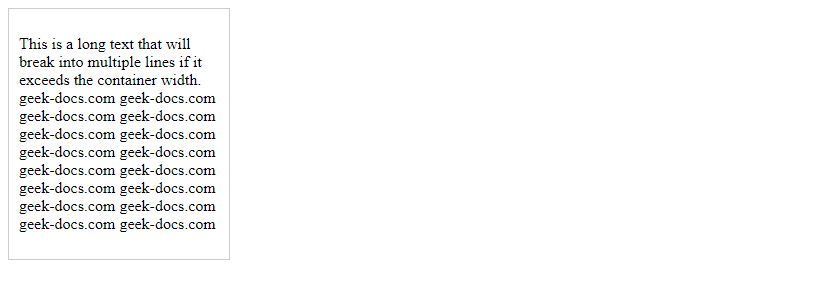
<p class="text">This is a long text that will break into multiple lines if it exceeds the container width. sotoolbox.com sotoolbox.com sotoolbox.com sotoolbox.com sotoolbox.com sotoolbox.com sotoolbox.com sotoolbox.com sotoolbox.com sotoolbox.com sotoolbox.com sotoolbox.com sotoolbox.com sotoolbox.com sotoolbox.com sotoolbox.com</p>
</div>
</body>
</html>
Output:

运行结果:文字内容超出容器宽度时会自动换行。
2. 使用overflow-wrap属性
overflow-wrap属性用于指定当一个单词太长而无法适应容器时是否允许换行。可以设置为normal或break-word。
示例代码如下:
<!DOCTYPE html>
<html lang="en">
<head>
<meta charset="UTF-8">
<title>Overflow Wrap Example</title>
<style>
    .container {
        width: 200px;
        border: 1px solid #ccc;
        padding: 10px;
    }
    .text {
        overflow-wrap: break-word;
    }
</style>
</head>
<body>
<div class="container">
    <p class="text">This is a long text that will break into multiple lines if it exceeds the container width. sotoolbox.com sotoolbox.com sotoolbox.com sotoolbox.com sotoolbox.com sotoolbox.com sotoolbox.com sotoolbox.com sotoolbox.com sotoolbox.com sotoolbox.com sotoolbox.com sotoolbox.com sotoolbox.com sotoolbox.com sotoolbox.com</p>
</div>
</body>
</html>
Output:

运行结果:文字内容超出容器宽度时会自动换行。
3. 使用white-space属性
white-space属性用于指定如何处理元素中的空白符。可以设置为normal、nowrap、pre、pre-line或pre-wrap。
示例代码如下:
<!DOCTYPE html>
<html lang="en">
<head>
<meta charset="UTF-8">
<title>White Space Example</title>
<style>
    .container {
        width: 200px;
        border: 1px solid #ccc;
        padding: 10px;
    }
    .text {
        white-space: normal;
    }
</style>
</head>
<body>
<div class="container">
    <p class="text">This is a long text that will break into multiple lines if it exceeds the container width. sotoolbox.com sotoolbox.com sotoolbox.com sotoolbox.com sotoolbox.com sotoolbox.com sotoolbox.com sotoolbox.com sotoolbox.com sotoolbox.com sotoolbox.com sotoolbox.com sotoolbox.com sotoolbox.com sotoolbox.com sotoolbox.com</p>
</div>
</body>
</html>
Output:
运行结果:文字内容超出容器宽度时会自动换行。
4. 使用text-overflow属性
text-overflow属性用于指定当文本溢出容器时如何显示溢出的部分。可以设置为clip、ellipsis或string。
示例代码如下:
<!DOCTYPE html>
<html lang="en">
<head>
<meta charset="UTF-8">
<title>Text Overflow Example</title>
<style>
    .container {
        width: 200px;
        border: 1px solid #ccc;
        padding: 10px;
        white-space: nowrap;
        overflow: hidden;
        text-overflow: ellipsis;
    }
</style>
</head>
<body>
<div class="container">
    This is a long text that will be truncated with an ellipsis if it exceeds the container width. sotoolbox.com sotoolbox.com sotoolbox.com sotoolbox.com sotoolbox.com sotoolbox.com sotoolbox.com sotoolbox.com sotoolbox.com sotoolbox.com sotoolbox.com sotoolbox.com sotoolbox.com sotoolbox.com sotoolbox.com sotoolbox.com
</div>
</body>
</html>
Output:
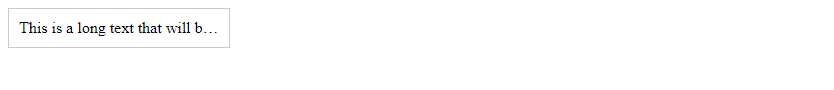
运行结果:文字内容超出容器宽度时会被截断并显示省略号。
5. 使用max-width属性
max-width属性用于指定元素的最大宽度。当元素的内容超出最大宽度时,会自动换行。
示例代码如下:
<!DOCTYPE html>
<html lang="en">
<head>
<meta charset="UTF-8">
<title>Max Width Example</title>
<style>
    .container {
        max-width: 200px;
        border: 1px solid #ccc;
        padding: 10px;
    }
</style>
</head>
<body>
<div class="container">
    This is a long text that will break into multiple lines if it exceeds the maximum width of the container. sotoolbox.com sotoolbox.com sotoolbox.com sotoolbox.com sotoolbox.com sotoolbox.com sotoolbox.com sotoolbox.com sotoolbox.com sotoolbox.com sotoolbox.com sotoolbox.com sotoolbox.com sotoolbox.com sotoolbox.com sotoolbox.com
</div>
</body>
</html>
Output:
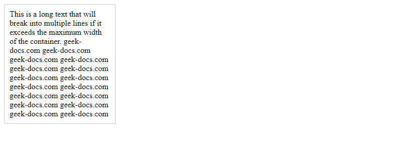
运行结果:文字内容超出最大宽度时会自动换行。
此处评论已关闭