CSS文本换行
在网页设计中,文本的换行是一个常见的需求。通过CSS样式可以控制文本的换行方式,使得文本在页面上显示更加美观和易读。本文将详细介绍CSS中文本换行的相关知识,并提供多个示例代码来演示不同的文本换行效果。
1. word-wrap属性
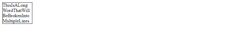
word-wrap属性用于指定当一个单词太长无法完全显示在一行时,是否允许将单词拆分成多行显示。该属性有两个取值:
normal:默认值,不允许单词拆分成多行显示。break-word:允许单词拆分成多行显示。
示例代码如下:
<!DOCTYPE html>
<html>
<head>
<style>
    .text {
        width: 100px;
        border: 1px solid #000;
        word-wrap: break-word;
    }
</style>
</head>
<body>

<div class="text">ThisIsALongWordThatWillBeBrokenIntoMultipleLines</div>

</body>
</html>
Output:

在上面的示例中,当单词太长无法完全显示在一行时,设置word-wrap: break-word;允许将单词拆分成多行显示。
2. white-space属性
white-space属性用于控制元素内文本的空白符处理方式。该属性有多个取值:
normal:默认值,合并连续的空白符,换行符和制表符。nowrap:不允许文本换行。pre:保留空白符,但不允许文本换行。pre-wrap:保留空白符,允许文本换行。pre-line:合并连续的空白符,保留换行符,允许文本换行。
示例代码如下:
<!DOCTYPE html>
<html>
<head>
<style>
    .text {
        width: 100px;
        border: 1px solid #000;
        white-space: pre-wrap;
    }
</style>
</head>
<body>

<div class="text">This is a long text that will be wrapped into multiple lines</div>

</body>
</html>
Output:
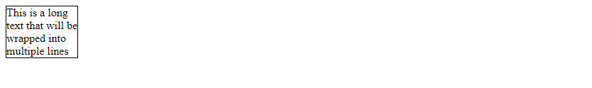
在上面的示例中,设置white-space: pre-wrap;允许文本换行,并保留空白符。
3. overflow-wrap属性
overflow-wrap属性用于指定当一个单词太长无法完全显示在一行时,是否允许将单词拆分成多行显示。该属性有两个取值:
normal:默认值,不允许单词拆分成多行显示。break-word:允许单词拆分成多行显示。
示例代码如下:
<!DOCTYPE html>
<html>
<head>
<style>
    .text {
        width: 100px;
        border: 1px solid #000;
        overflow-wrap: break-word;
    }
</style>
</head>
<body>

<div class="text">ThisIsALongWordThatWillBeBrokenIntoMultipleLines</div>

</body>
</html>
Output:
在上面的示例中,当单词太长无法完全显示在一行时,设置overflow-wrap: break-word;允许将单词拆分成多行显示。
4. text-overflow属性
text-overflow属性用于指定当文本溢出容器时,如何显示溢出的部分。该属性有三个取值:
clip:默认值,直接裁剪文本。ellipsis:在文本末尾显示省略号。string:在文本末尾显示指定的字符串。
示例代码如下:
<!DOCTYPE html>
<html>
<head>
<style>
    .text {
        width: 100px;
        border: 1px solid #000;
        white-space: nowrap;
        overflow: hidden;
        text-overflow: ellipsis;
    }
</style>
</head>
<body>

<div class="text">This is a long text that will be truncated with an ellipsis</div>

</body>
</html>
Output:

在上面的示例中,设置text-overflow: ellipsis;在文本末尾显示省略号。
5. 使用max-width属性控制文本换行
max-width属性用于指定元素的最大宽度,当元素内文本超过最大宽度时,会自动换行。结合word-wrap属性可以实现文本的自动换行效果。
示例代码如下:
<!DOCTYPE html>
<html>
<head>
<style>
    .text {
        max-width: 200px;
        border: 1px solid #000;
        word-wrap: break-word;
    }
</style>
</head>
<body>

<div class="text">This is a long text that will be wrapped into multiple lines when it exceeds the maximum width</div>

</body>
</html>
Output:
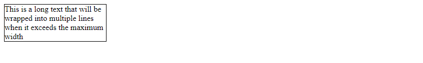
在上面的示例中,设置max-width: 200px;当文本超过最大宽度时,会自动换行。
6. 使用media query实现响应式文本换行
通过使用@media查询可以实现在不同屏幕尺寸下的文本换行效果,从而实现响应式设计。
示例代码如下:
<!DOCTYPE html>
<html>
<head>
<style>
    .text {
        width: 100px;
        border: 1px solid #000;
        word-wrap: break-word;
    }

    @media screen and (max-width: 600px) {
        .text {
            width: 50px;
        }
    }
</style>
</head>
<body>

<div class="text">This is a long text that will be wrapped into multiple lines on smaller screens</div>

</body>
</html>
Output:
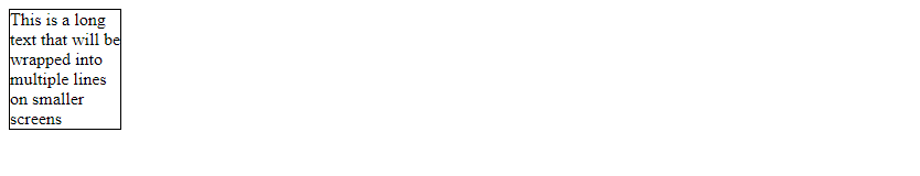
在上面的示例中,通过@media查询在不同屏幕尺寸下设置不同的文本宽度,实现了响应式文本换行效果。
7. 使用flex布局实现文本换行
通过使用flex布局可以实现灵活的文本换行效## 8. 使用flex-wrap属性实现文本换行
flex-wrap属性用于指定flex容器内的项目是否换行。该属性有三个取值:
nowrap:默认值,所有项目在一行内排列,不换行。wrap:项目在必要时换行。wrap-reverse:项目在必要时换行,但是反向排列。
示例代码如下:
<!DOCTYPE html>
<html>
<head>
<style>
    .flex-container {
        display: flex;
        flex-wrap: wrap;
    }
    .item {
        width: 100px;
        border: 1px solid #000;
    }
</style>
</head>
<body>

<div class="flex-container">
    <div class="item">This is a long text that will be wrapped into multiple lines</div>
    <div class="item">Another long text that will be wrapped into multiple lines</div>
</div>

</body>
</html>
Output:
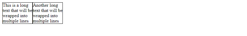
在上面的示例中,设置flex-wrap: wrap;使得flex容器内的项目在必要时换行。
9. 使用grid布局实现文本换行
通过使用grid布局可以实现更加灵活的文本换行效果,可以根据需要自定义文本的布局方式。
示例代码如下:
<!DOCTYPE html>
<html>
<head>
<style>
    .grid-container {
        display: grid;
        grid-template-columns: repeat(3, 1fr);
        gap: 10px;
    }
    .item {
        border: 1px solid #000;
    }
</style>
</head>
<body>

<div class="grid-container">
    <div class="item">This is a long text that will be wrapped into multiple lines</div>
    <div class="item">Another long text that will be wrapped into multiple lines</div>
    <div class="item">Yet another long text that will be wrapped into multiple lines</div>
</div>

</body>
</html>
Output:
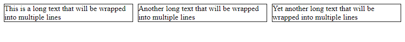
在上面的示例中,通过grid布局实现了文本的自动换行效果,并且可以自定义文本的布局方式。
10. 使用text-align属性控制文本对齐方式
text-align属性用于指定文本的水平对齐方式,可以控制文本在元素内的水平位置。
示例代码如下:
<!DOCTYPE html>
<html>
<head>
<style>
    .text {
        width: 200px;
        border: 1px solid #000;
        text-align: center;
    }
</style>
</head>
<body>

<div class="text">This is a centered text that will be wrapped into multiple lines</div>

</body>
</html>
Output:
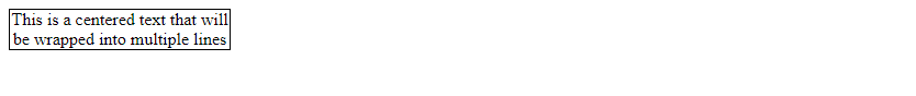
在上面的示例中,设置text-align: center;使得文本在元素内水平居中对齐。
11. 使用text-indent属性控制文本缩进
text-indent属性用于指定文本的首行缩进,可以控制文本在元素内的缩进效果。
示例代码如下:
<!DOCTYPE html>
<html>
<head>
<style>
    .text {
        width: 200px;
        border: 1px solid #000;
        text-indent: 20px;
    }
</style>
</head>
<body>

<div class="text">This is an indented text that will be wrapped into multiple lines</div>

</body>
</html>
Output:
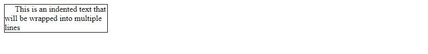
在上面的示例中,设置text-indent: 20px;使得文本的首行缩进20px。
12. 使用line-height属性控制文本行高
line-height属性用于指定文本行高,可以控制文本行与行之间的间距。
示例代码如下:
<!DOCTYPE html>
<html>
<head>
<style>
    .text {
        width: 200px;
        border: 1px solid #000;
        line-height: 1.5;
    }
</style>
</head>
<body>

<div class="text">This is a text with increased line height that will be wrapped into multiple lines</div>

</body>
</html>
Output:
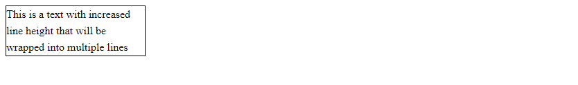
在上面的示例中,设置line-height: 1.5;使得文本行高为字体大小的1.5倍。
13. 使用letter-spacing属性控制字符间距
letter-spacing属性用于指定字符之间的间距,可以控制文本中字符之间的距离。
示例代码如下:
<!DOCTYPE html>
<html>
<head>
<style>
    .text {
        border: 1px solid #000;
        letter-spacing: 2px;
    }
</style>
</head>
<body>

<div class="text">This is a text with increased letter spacing</div>

</body>
</html>
Output:

在上面的示例中,设置letter-spacing: 2px;使得文本中字符之间的间距为2px。
14. 使用text-transform属性转换文本大小写
text-transform属性用于指定文本的大小写转换方式,可以将文本转换为大写、小写或首字母大写。
示例代码如下:
<!DOCTYPE html>
<html>
<head>
<style>
    .text-uppercase {
        text-transform: uppercase;
    }
    .text-lowercase {
        text-transform: lowercase;
    }
    .text-capitalize {
        text-transform: capitalize;
    }
</style>
</head>
<body>

<div class="text-uppercase">This is an uppercase text</div>
<div class="text-lowercase">THIS IS A LOWERCASE TEXT</div>
<div class="text-capitalize">this is a capitalized text</div>

</body>
</html>
Output:
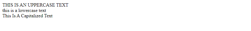
在上面的示例中,通过text-transform属性将文本转换为大写、小写或首字母大写。
15. 使用text-decoration属性添加文本装饰
text-decoration属性用于指定文本的装饰效果,可以添加下划线、删除线、上划线等效果。
示例代码如下:
<!DOCTYPE html>
<html>
<head>
<style>
    .text-underline {
        text-decoration: underline;
    }
    .text-line-through {
        text-decoration: line-through;
    }
    .text-overline {
        text-decoration: overline;
    }
</style>
</head>
<body>

<div class="text-underline">This is an underlined text</div>
<div class="text-line-through">This is a text with line-through decoration</div>
<div class="text-overline">This is a text with overline decoration</div>

</body>
</html>
Output:
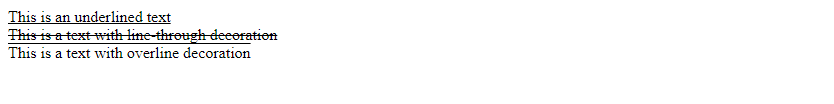
text-shadow属性用于为文本添加阴影效果,可以指定阴影的水平偏移、垂直偏移、模糊半径和颜色。
示例代码如下:
<!DOCTYPE html>
<html>
<head>
<style>
    .text {
        text-shadow: 2px 2px 2px #000;
    }
</style>
</head>
<body>

<div class="text">This is a text with shadow effect</div>

</body>
</html>
Output:

在上面的示例中,设置text-shadow: 2px 2px 2px #000;为文本添加了水平和垂直偏移为2px的阴影效果。
- 使用text-overflow属性控制文本溢出效果
text-overflow属性用于控制文本溢出时的显示效果,可以指定文本溢出时是否显示省略号或其他内容。
示例代码如下:
<!DOCTYPE html>
<html>
<head>
<style>
    .text {
        width: 100px;
        white-space: nowrap;
        overflow: hidden;
        text-overflow: ellipsis;
        border: 1px solid #000;
    }
</style>
</head>
<body>

<div class="text">This is a long text that will be truncated with ellipsis</div>

</body>
</html>
Output:

在上面的示例中,设置text-overflow: ellipsis;使得文本溢出时显示省略号。
- 使用word-spacing属性控制单词间距
word-spacing属性用于指定单词之间的间距,可以控制文本中单词之间的距离。
示例代码如下:
<!DOCTYPE html>
<html>
<head>
<style>
    .text {
        word-spacing: 10px;
    }
</style>
</head>
<body>

<div class="text">This is a text with increased word spacing</div>

</body>
</html>
Output:

在上面的示例中,设置word-spacing: 10px;使得文本中单词之间的距离为10px。
- 使用text-justify属性控制文本对齐方式
text-justify属性用于指定文本的对齐方式,可以控制文本在元素内的对齐方式,特别是在两端对齐时的处理方式。
示例代码如下:
<!DOCTYPE html>
<html>
<head>
<style>
    .text {
        text-align: justify;
    }
</style>
</head>
<body>

<div class="text">This is a justified text that will be wrapped into multiple lines</div>

</body>
</html>
Output:

在上面的示例中,设置text-align: justify;使得文本在元素内两端对齐,并且自动调整单词间的间距。
- 使用text-orientation属性控制文本方向
text-orientation属性用于指定文本的方向,可以控制文本的排列方式,如横向排列或竖向排列。
示例代码如下:
<!DOCTYPE html>
<html>
<head>
<style>
    .text {
        writing-mode: vertical-rl;
    }
</style>
</head>
<body>

<div class="text">This is a vertically oriented text</div>

</body>
</html>
Output:
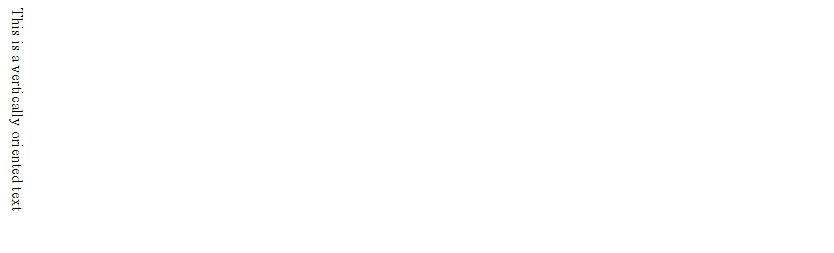
在上面的示例中,设置writing-mode: vertical-rl;使得文本竖向排列。
此处评论已关闭